2019
Personal
Event Design

Background
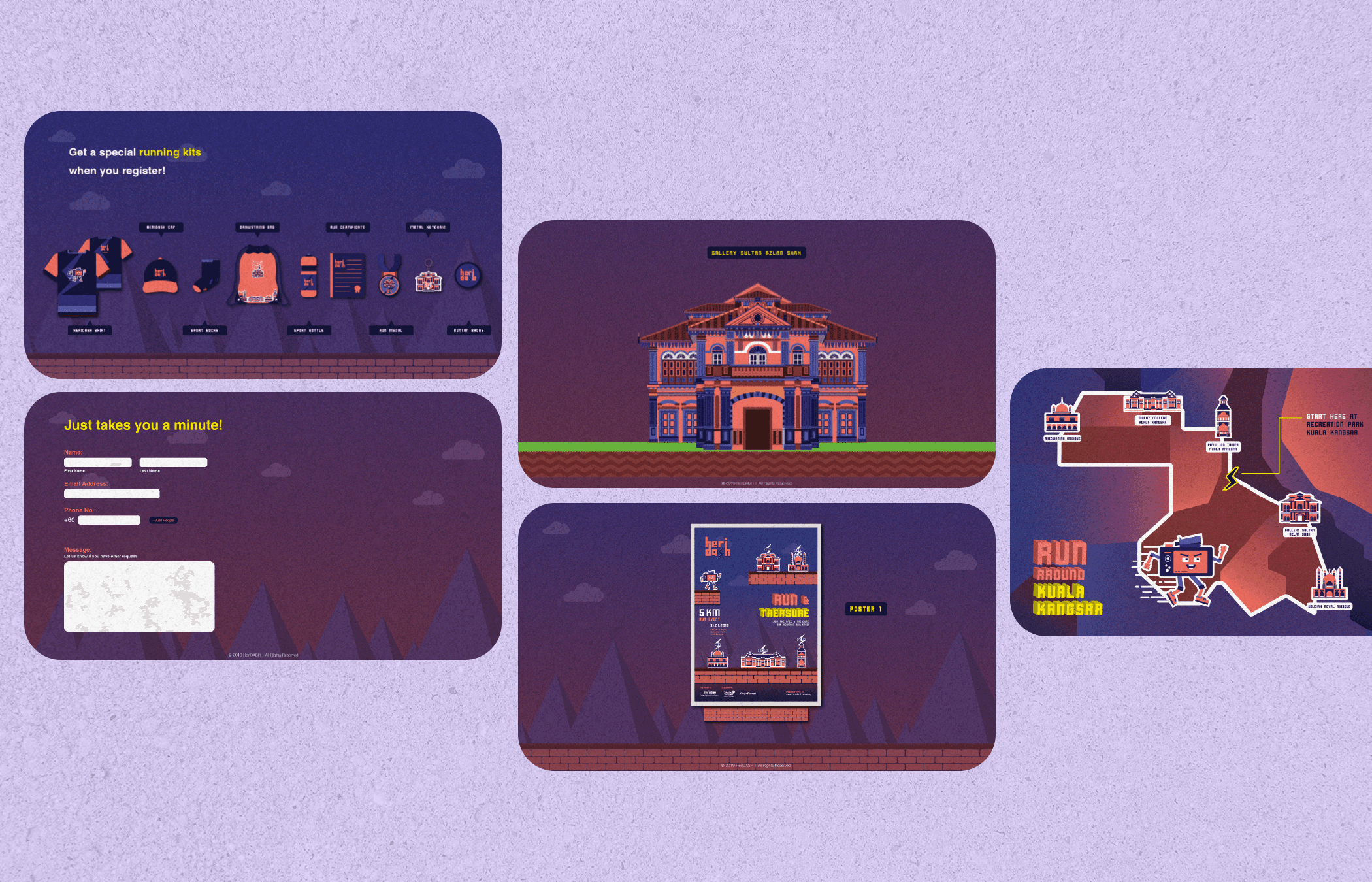
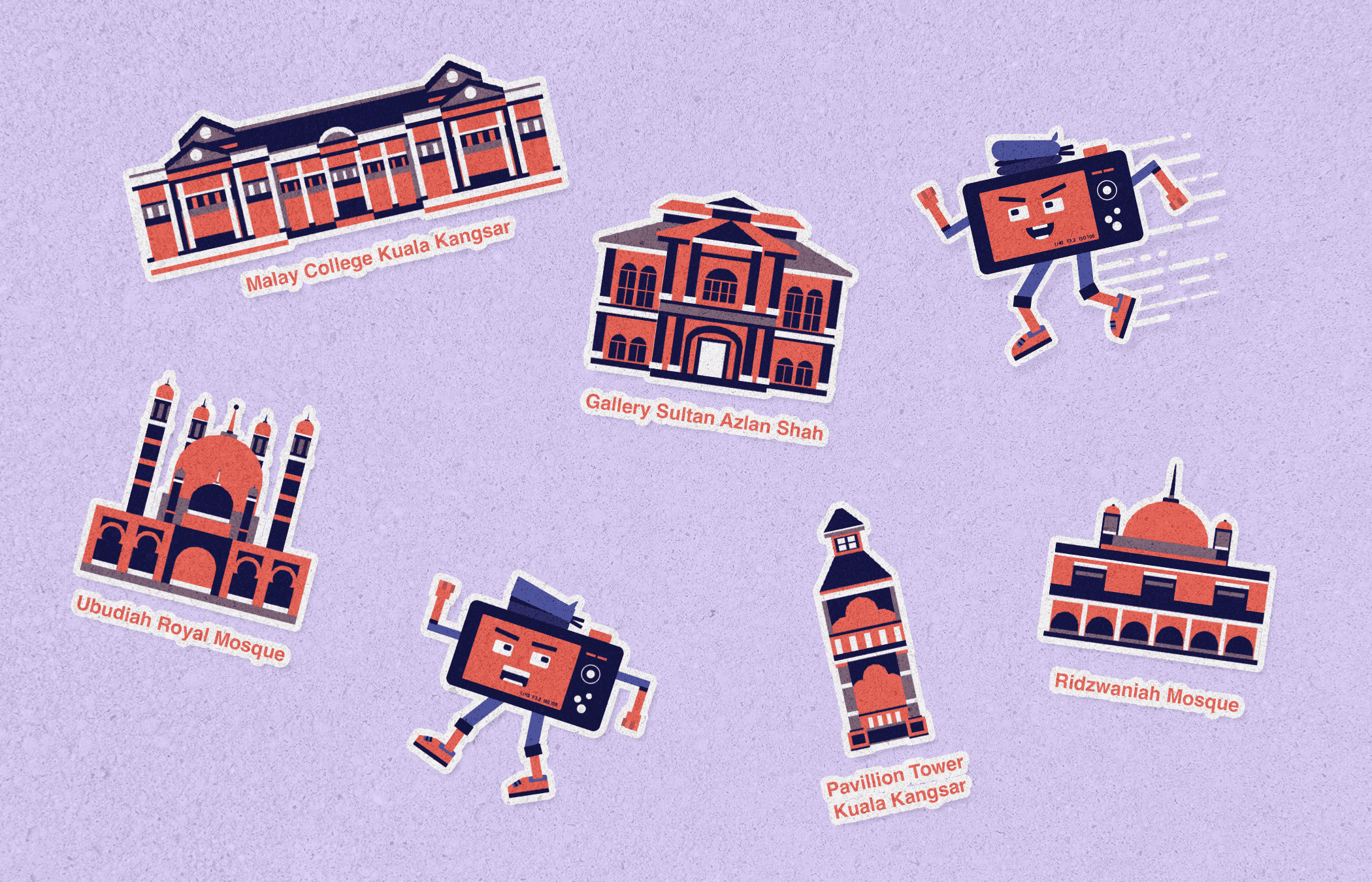
HeriDASH is where Malaysian heritage buildings trade their stiff, serious museum vibes for something way more energetic: a 5km "Run Around Kuala Kangsar" visual adventure! Inspired by the rich architectural legacy of the region, this project transforms iconic structures into lively, character-driven illustrations that live within a vibrant race map. At its heart, it’s all about reimagining heritage through a modern, playful lens - because who says history can’t be fun?
Core problem
Let’s face it, heritage buildings often get wrapped up in stiff educational content or dry preservation campaigns. The challenge? Make people (especially younger audiences) feel connected to these architectural gems without boring them to tears. I needed a way to bring the buildings to life - literally - so they could be part of an experience that felt like play, not a lecture.

My Process
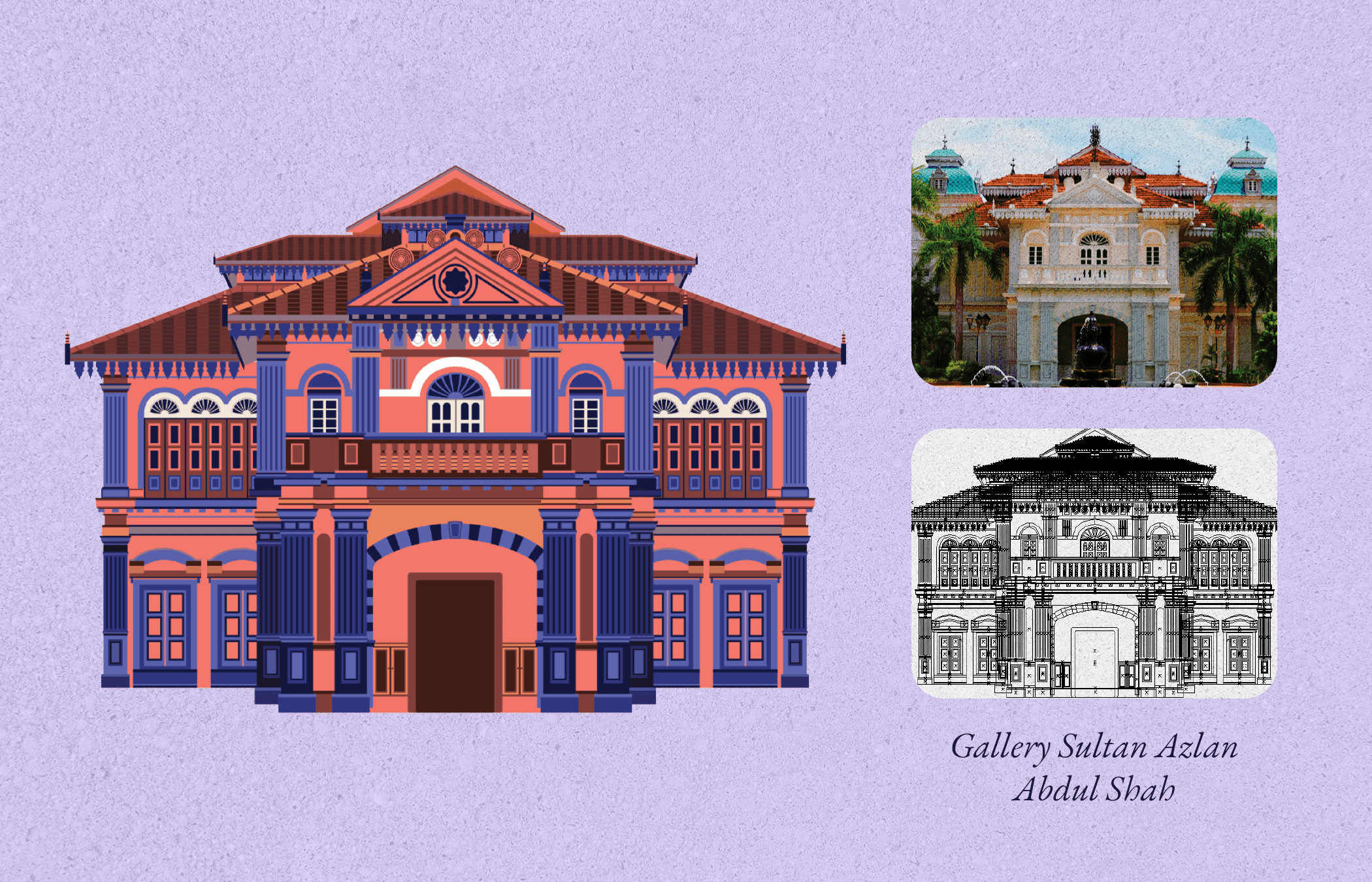
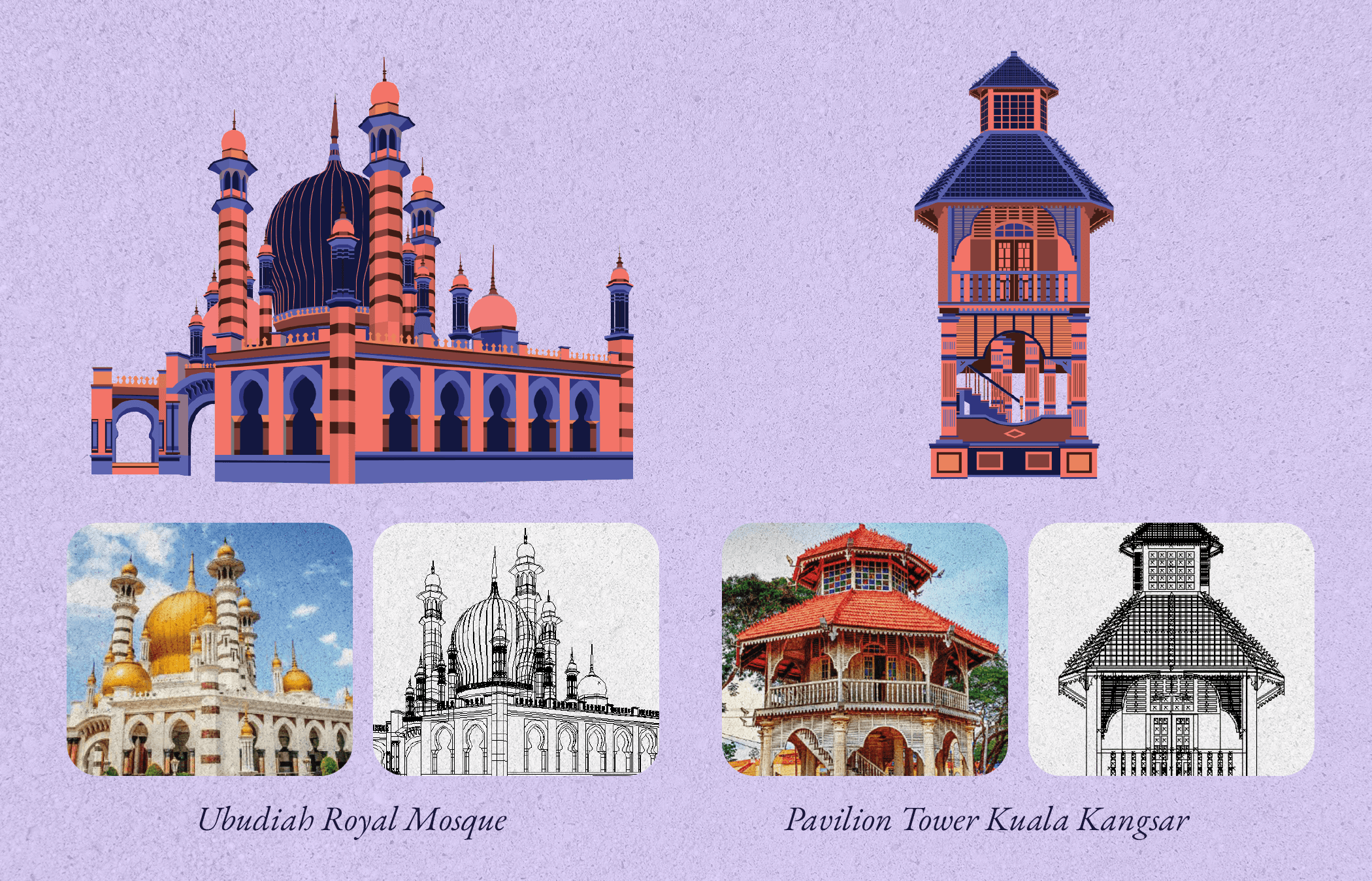
Research & Deconstruction: I started by diving into architectural features of iconic buildings like the Gallery Sultan Idris Abdul Shah, distilling each one into simplified, memorable forms without losing their personality. Domes, spires, windows? All turned into stylized icons with a geometric twist.
Color Story Development: Coral-orange and deep navy were chosen to inject life and energy while still feeling bold and grounded; like a heritage-themed sunset that you can’t look away from.
Character Design: Enter the square-shaped mascot; your energetic little buddy bouncing through landmarks like it’s training for the Olympics. This character adds a layer of interactivity and movement to the journey.
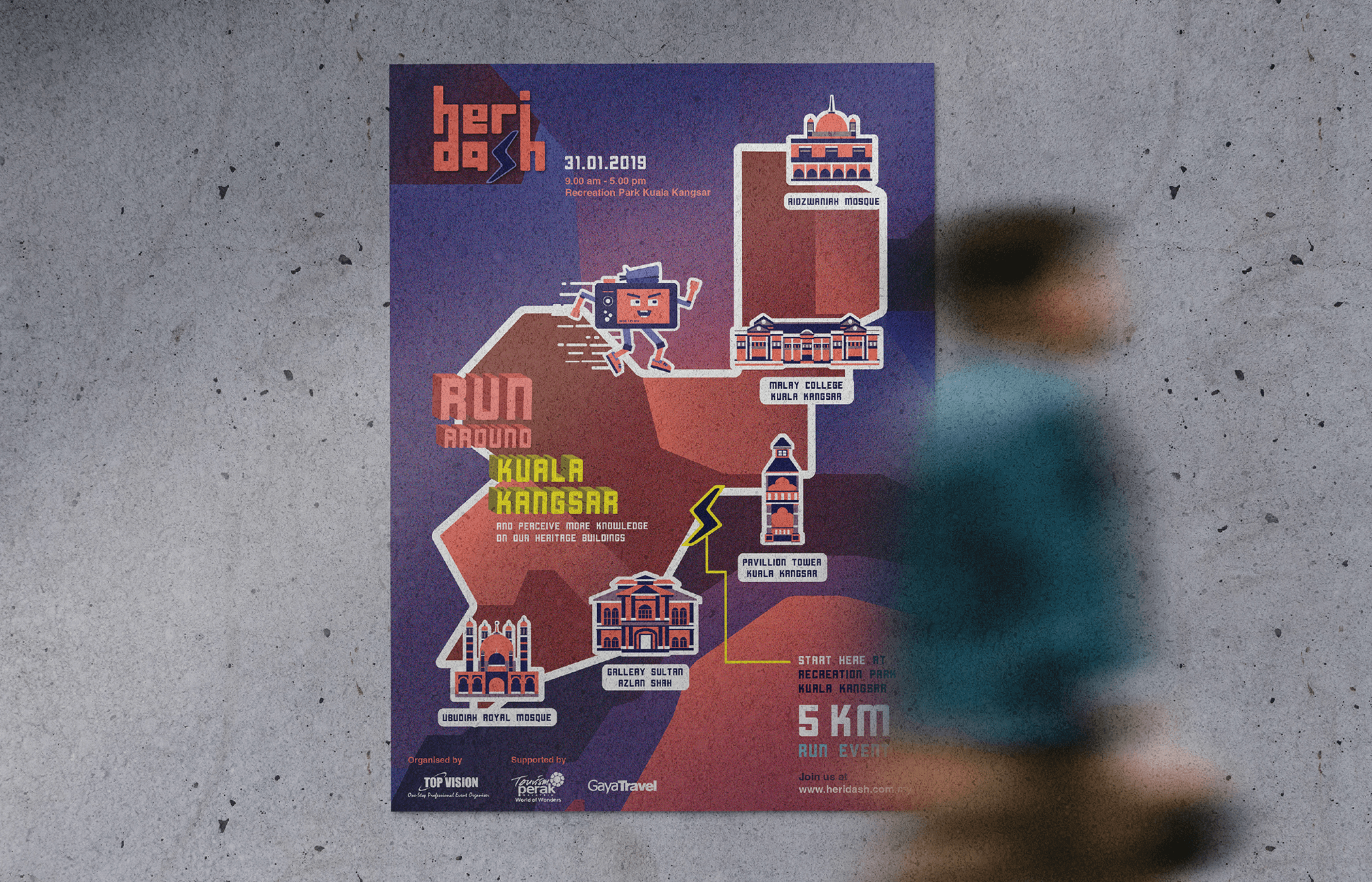
Interactive Layout Design: Instead of a flat poster, the route map was turned into a game-like environment with elevation, path connections, and "moments" to discover along the way.
Style Consistency: Every element was treated with the same playful-yet-respectful design rulebook, from sticker-style buildings to interactive scenes and pattern overlays.
Key Actions Taken
Gamified Route Map Design: Transformed a standard event poster into an illustrated adventure map that encourage exploration.
Playful Character Integration: Introduced a square-shaped mascot that becomes a visual tour guide, guiding participants along the 5km route with humor and energy.
Heritage-Inspired Visual System: Simplified historic buildings into geometric, Instagrammable icons that retained signature features while appealing to a modern, design-savvy audience.
Detailed Architectural Illustrations: Created a highly detailed vector illustration series of historic buildings to honor their architectural integrity. These were complemented by simplified icon versions for flexible branding use across touchpoints (social media, merchandise, signage).
Cultural Remix with Respect: Blended lighthearted aesthetics with reverence; ensuring that while the tone is playful, the legacy of the buildings remains central. The goal was to spark curiosity without trivializing history.
Motion Design Video: Developed a Mario-style motion graphic where the mascot “runs” past the heritage landmarks, combining gaming aesthetics with real cultural storytelling. This video was used as a teaser and promo asset to build hype.
Outcomes
Reframed Heritage as Playful: Turned traditional buildings into accessible, adorable characters that made historical architecture feel approachable, not intimidating.
Cross-Generational Appeal: Engaged younger audiences through gaming-inspired visuals, while older viewers appreciated the respectful nods to cultural icons.
Increased Community Engagement: The unique visual system made the event more shareable and buzzworthy, driving interest in both the race and local heritage appreciation.
Versatile Brand Assets: Created a visual toolkit; buildings, patterns, characters, and paths, that could be used across posters, merchandise, event signage, and even apps.
Design That Moves (Literally!): This wasn't just a map; it was a movement. HeriDASH got people excited to physically explore their culture, sneakers laced and cameras ready.