2024
Personal
Branding

Background
Bewtyroot is a sustainable haircare brand with a mission to shake up the beauty scene by blending high-performance products with personality-packed design. At the heart of the brand? Beetroot – a natural, eco-conscious ingredient full of hair-loving benefits. This project was all about building a visual identity that feels like your effortlessly cool best friend: smart, stylish, and just the right amount of quirky. The goal? To make great hair days feel fun again, without compromising on values like sustainability and quality.
Core problem
Most haircare branding either leans too clinical or too glossy; leaving little room for playful, personality-driven storytelling. The challenge here was to craft a visual identity that could reflect the brand’s expertise and its fun-loving attitude. It had to stand out in a saturated beauty market, appeal to modern eco-conscious consumers, and still feel premium. How do you make a beauty brand feel human, relatable, and refreshingly not boring?
My Process
Brand Discovery: I started by diving deep into the brand’s ethos; natural ingredients, sustainable practices, and a light-hearted, confident tone. This helped shape every design decision.
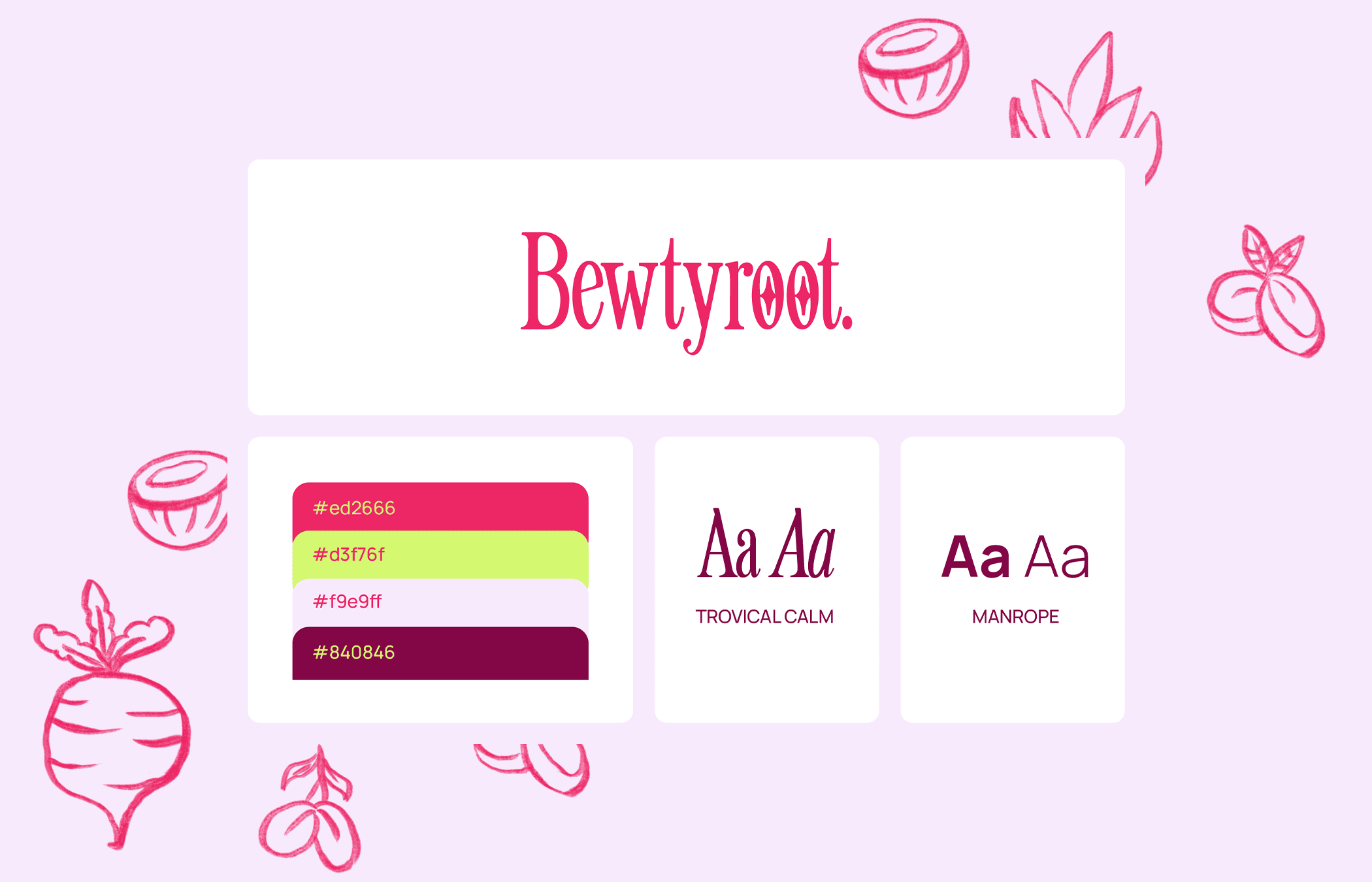
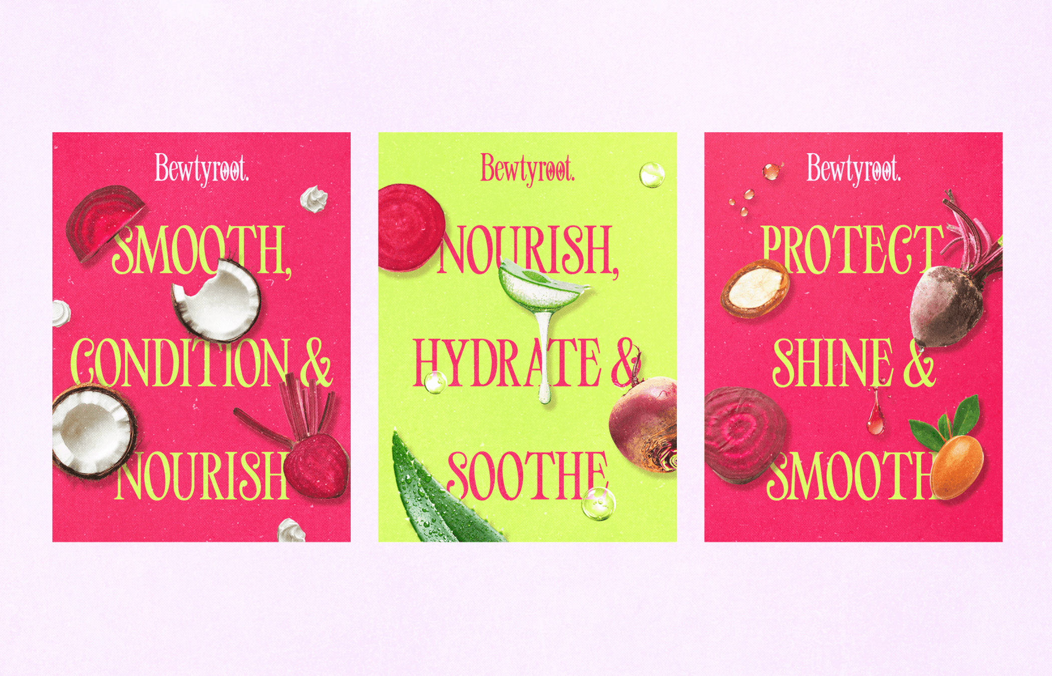
Color & Typography Exploration: Bold fuchsia and lime green made the perfect power duo; eye-catching, fresh, and a bit unexpected in the haircare space. Paired with retro-inspired type, it immediately gave the brand a fun, slightly nostalgic edge.
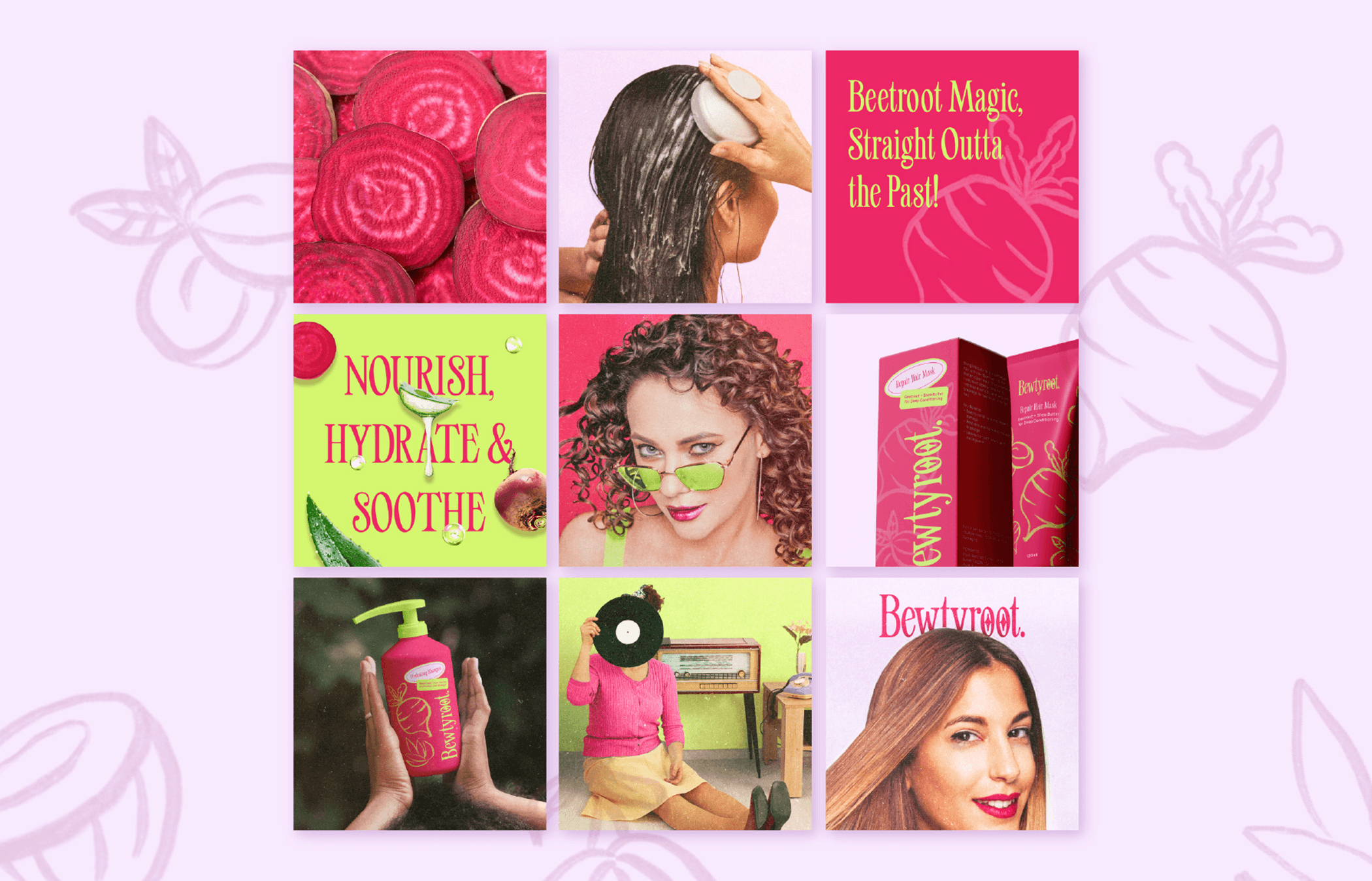
Custom Visual Language: I developed a set of ingredients' illustrations that could live across packaging, social media, and marketing touchpoints. It’s consistent but never boring.
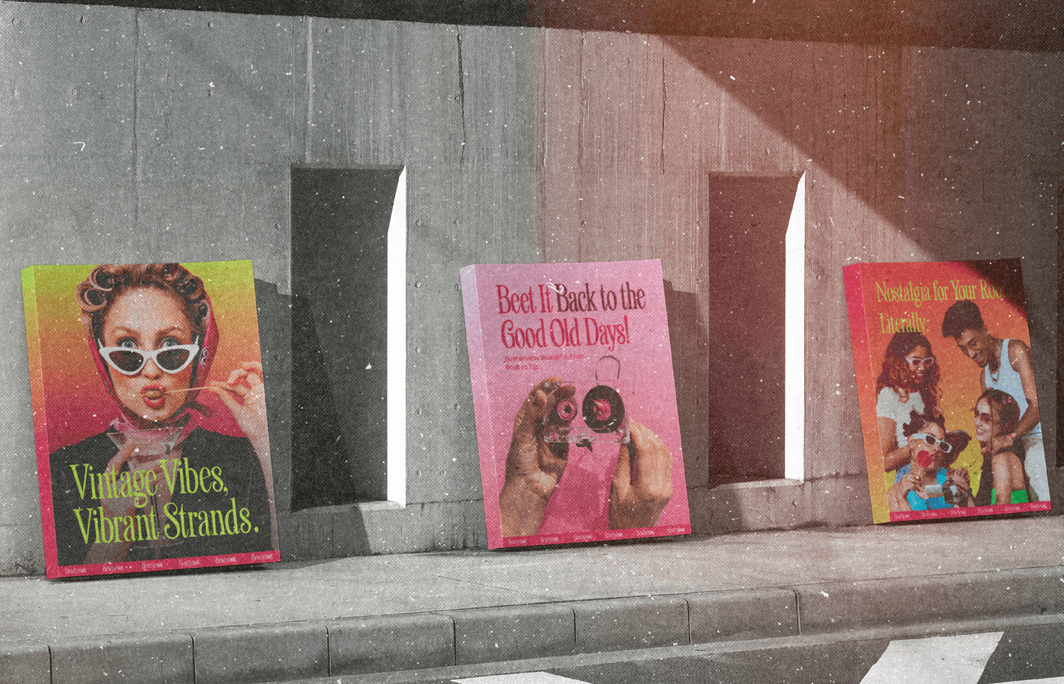
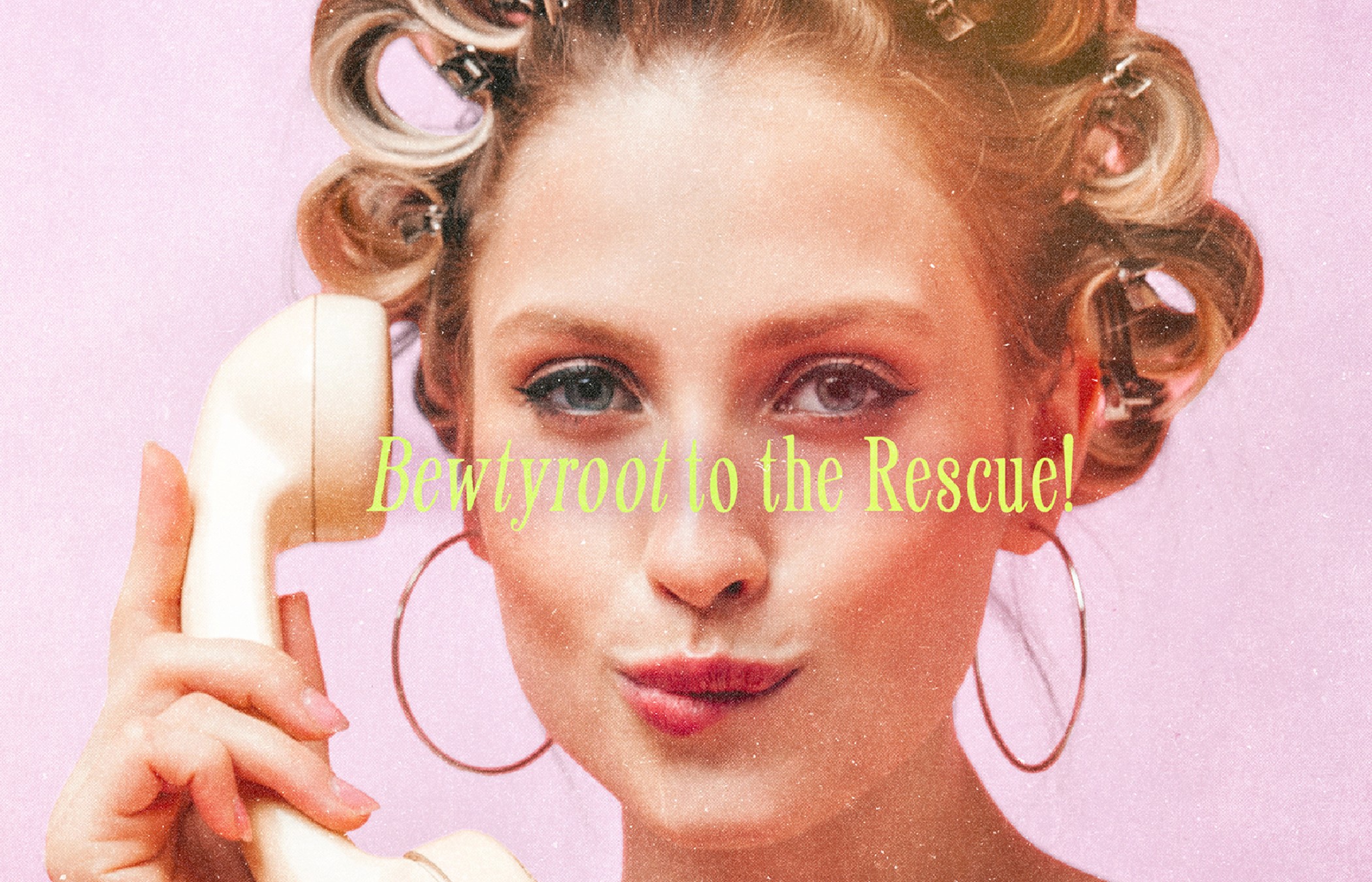
Photography Art Direction: Moving away from the typical glossy hair shots, I art-directed editorial-style imagery with personality; think vintage curlers, bold styling, and whimsical props (hello, retro TV!).
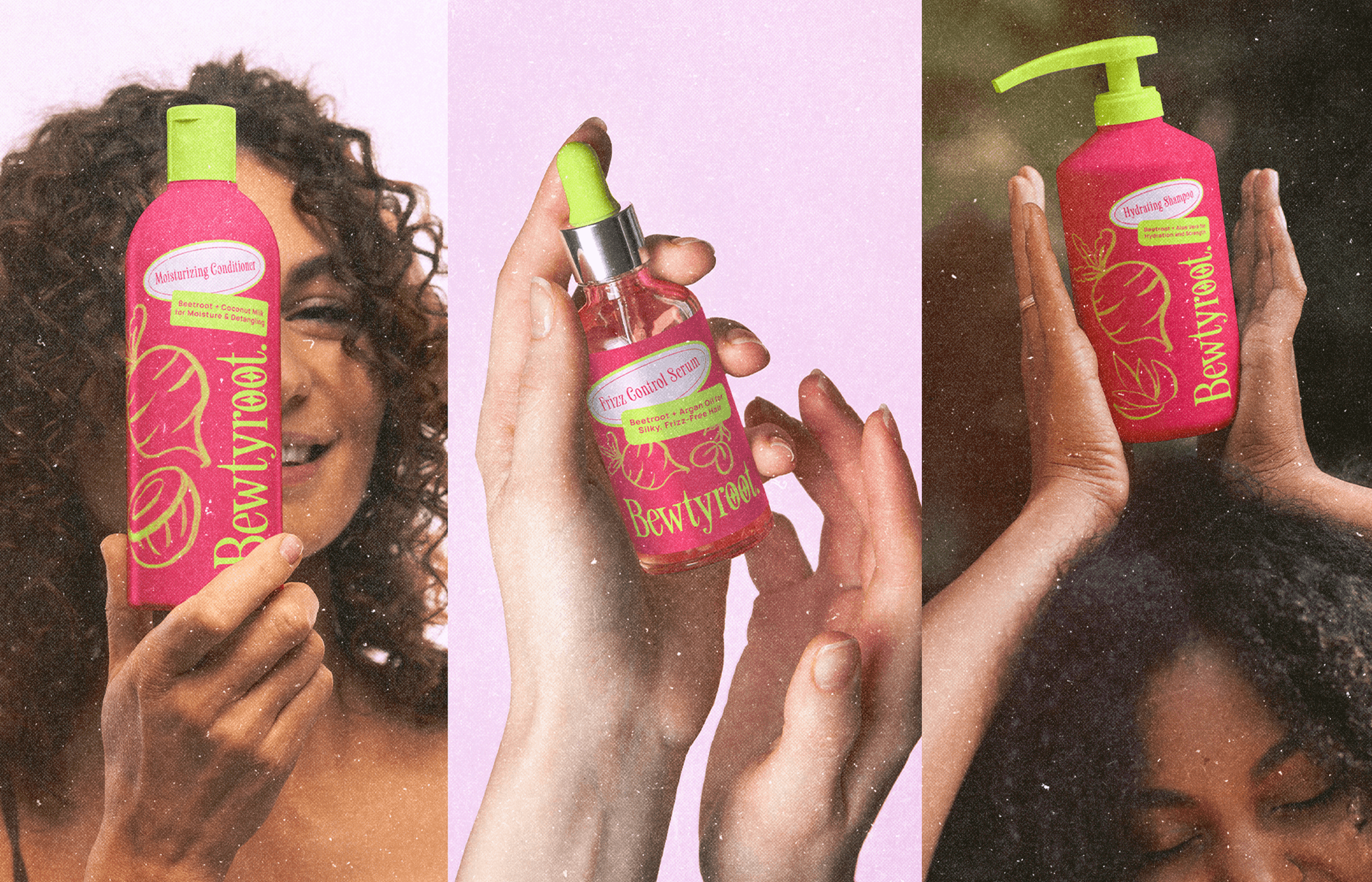
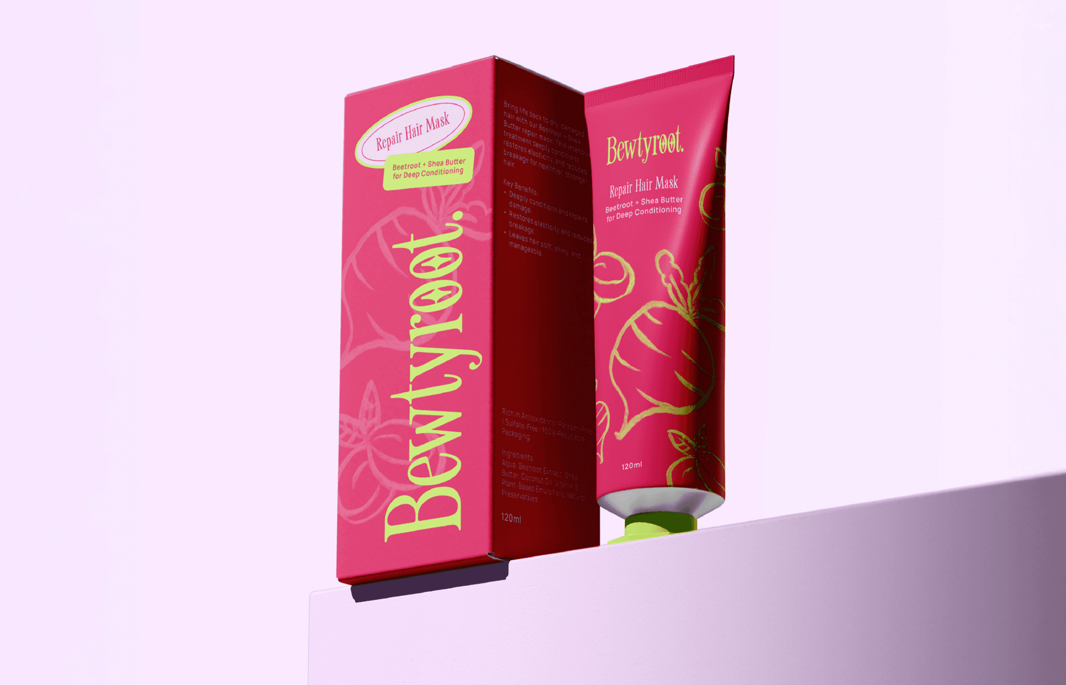
Packaging Strategy: Each product design combined strong typography with bright visuals and clear messaging to ensure shelf appeal and usability.
Key Actions Taken
Vibrant Visual Identity: Crafted a bold, retro-feminine brand identity using bright, punchy colors and custom typography that instantly grabs attention.
Playful Product Packaging: Designed packaging that’s both fun and functional, balancing strong brand visuals with clear product benefits for easy customer navigation.
Quirky Editorial Photography: Directed a photo style that breaks beauty norms; mixing fashion-forward vibes with everyday relatability to tell a richer brand story.
Nostalgia-Driven Storytelling: Integrated vintage-inspired elements (like the old-school TV) to trigger emotional connection while keeping the brand aesthetic fresh and current.
Comprehensive Brand Guidelines: Built a complete identity system, from logo variations to color breakdowns and usage rules, ensuring consistency across every platform and piece of collateral.
Outcomes
Breakthrough Shelf Presence: The bold color and retro visuals helped Bewtyroot stand out instantly in a competitive beauty landscape.
Emotional Brand Connection: The brand’s playful storytelling and nostalgic cues resonated with consumers looking for authenticity and fun in their beauty routine.
Elevated, Editorial-Driven Aesthetic: The unique art direction positioned the brand more like a fashion label than a traditional haircare line; helping elevate its perception and appeal.
Cohesive Across All Touchpoints: From packaging to social to website mockups, every piece felt unmistakably Bewtyroot; proof that playful and professional can absolutely co-exist.
Sustainability Spotlighted: The natural beetroot story wasn’t lost in the design; it was front and center, proving that eco-conscious branding doesn’t have to be beige and boring.